MentorLink
Project: MentorLink
Role: Concept, Research, UX Designer
Duration: July - Sept 2022
Project Vision
MentorLink is a website designed to connect students with experienced mentors in their desired field of study. The goal is to have students gain insights and advice from mentors who are active in their industries. Students can search or browse mentor profiles and connect with them through a messaging system. The site also offers resources and FAQs to further help guide students through the mentorship process.
Challenges
Confusing navigation and labeling
Lack of search filtering options
Overwhelming or unclear information on mentor profiles
User Research
I began by gathering insights from participants during the usability studies. This helped me identify pain points that students would have while navigating the MentorLink site, including issues with mentor discovery and communication. Using this research, I developed a new sitemap and user flows to create wireframes and prototypes that addressed these pain points. The resulting design provides a simplified and intuitive mentorship experience for students, making it easier to find and connect with the right mentor.
Who is the target audience?
What are the main pain points that the user would encounter while on the website?
What features and functionalities would students expect from a mentorship request website?
Are there existing mentorship sites that address student’s needs and how?
Understanding the User
I conducted empathy maps and moderated usability studies to understand user navigation on the MentorLink website. Feedback from student participants led to design changes, including an advanced search, video options for expert advice, and renaming unclear sections of the site.
Meet the Users
Name: Joseph
Age: 21
Occupation: Full-time Student
Joseph is a fast learner who is passionate about all things tech. He’s the first to be on track to graduate in his immediate family and has been a self-starter all his life. He is eager to finally be closer to obtaining his degree and working in a team environment. He struggles to find some guidance on how to network with the right people and achieve his career goals.
Name: Amerie
Age: 22
Occupation: Full-time Student
Amerie is a third-year college student majoring in computer science. She is passionate about technology and eager to start her career in the tech industry. However, Amerie feels overwhelmed with the demands of her coursework, internships, extracurricular activities, and job applications. She has heard about the benefits of mentorship, but is nervous about the process and unsure of where to begin.
Paper Wireframes
During the initial design phase, I created sketches of the app's layout for multiple screens that focused on categorization and the arrangement of information to enhance the user's ability to locate all relevant details about the auctioned items.
Sitemap
The sitemap for the MentorLink website was designed with the user in mind, especially for students who may be navigating the site for the first time. It was important that I made sure to group related content together to improve the user experience.
Digital Wireframes
Challenge #1
Confusing Navigation and Labeling:
Clear labeling and easy navigation were crucial for the success of MentorLink. Without these elements, students may become confused and frustrated, leading to a negative experience with the platform. A well-labeled and easily navigable site ensures that users can quickly find what they're looking for and feel confident in their ability to use the platform effectively. The messages section of the site was previously named “Mentor Sessions” and was quickly changed as participants did not associate the terminology with a chat feature.
Challenge #2
Lack of Search Filtering Options:
It was important to note from the feedback during the usability studies that providing search filtering options was crucial for helping students find the most relevant and suitable mentors. Without these filtering options, students became overwhelmed with a long list of mentors, causing frustration and discouraging them from using the platform.
Challenge #3
Overwhelming or Unclear Information on Mentor Profiles:
Participants gave feedback about the importance of finding clear and concise helpful information about potential mentors. I found that students were often frustrated when encountering mentor profiles that lacked essential information or provided ambiguous details. It was essential to keep mentor profiles with relevant information for students to be able to find the right mentor for their needs.
User Flow
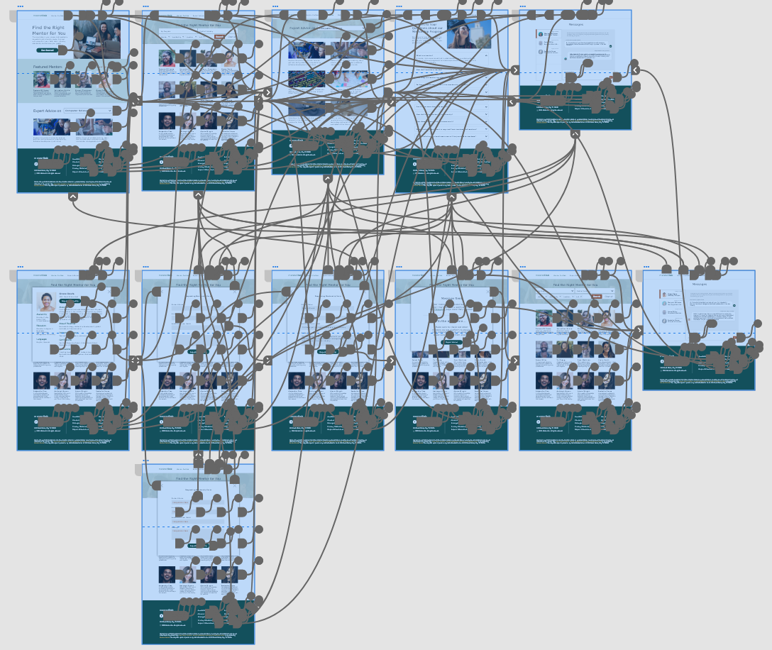
Additional screens were added to enhance the request process, allowing for a more seamless user experience. The user flow aims to allow students to easily navigate through the request process, reducing frustration and increasing the likelihood of successful mentorship connections.
Accessibility Considerations
Clear & Concise Language
The use of clear and concise language prevented the use of any complex and misleading labeling, helping the site more accessible to users with cognitive or language impairments.
Color & Contrast
To ensure legibility for those who are visually impaired, color contrast was taken into account during the visual design of the site.
Typographic Hierarchy
Using a proper typographic hierarchy helps users understand the structure of the page for easy navigation throughout.
Takeaways
After conducting usability testing, the changes in navigation and labeling had a significant impact on the user’s ability to find and connect with mentors. The high-contrast color scheme engaged and assisted users in browsing and engaging with their options on the site. I learned the importance of language and labeling, as my bias got in the way of what I considered to be the clearer option. The exact opposite was true for users at the beginning stages of the design process.


