Thrive Buddy
Project: Thrive Buddy app and website
Role: Concept, Research, UX Designer
Duration: Dec 2022 - Feb 2023
Project Vision
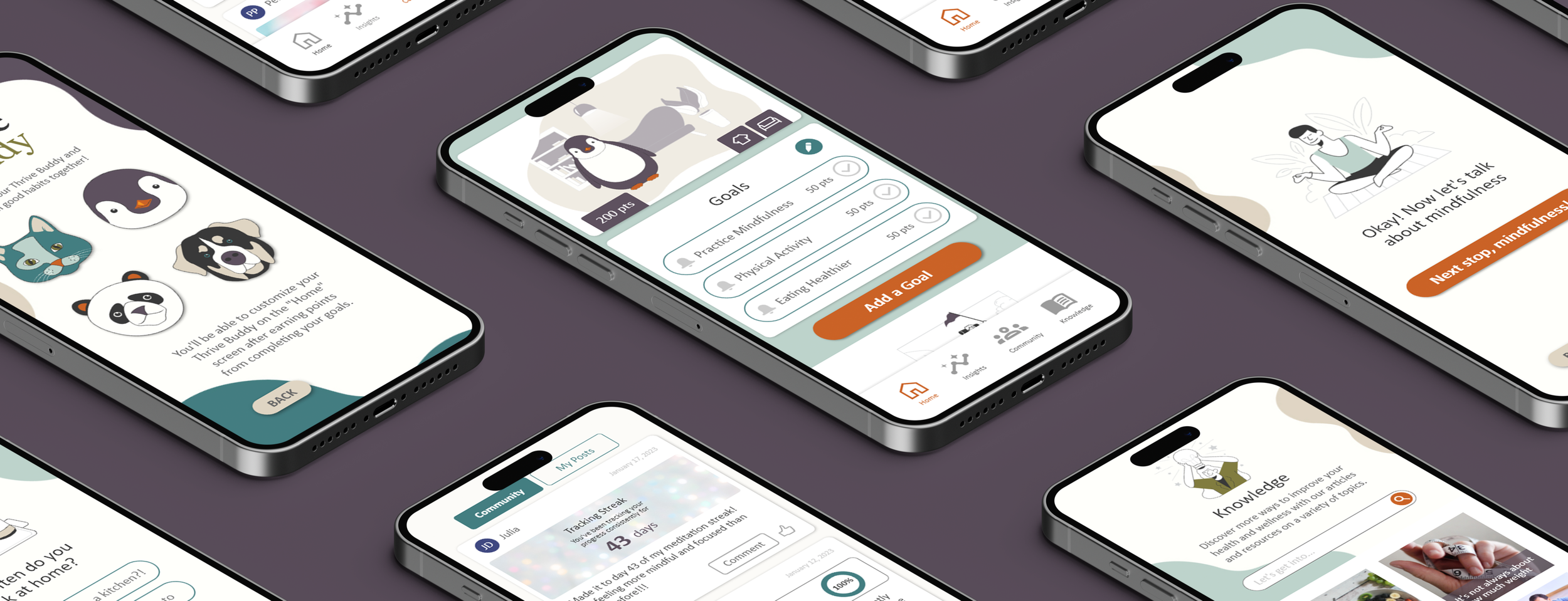
Maintaining healthy habits is incredibly hard, especially with so many competing priorities. As young adults begin to navigate the world on their own, they may face new stresses and challenges that can make it tempting to turn to unhealthy coping mechanisms like overeating, drinking, or smoking. The Thrive Buddy app gives young adults a way to develop healthy lifestyle habits by offering a variety of features, including progress tracking, reminders, community support, and a virtual buddy. While also providing articles, recipes, and tips to help them reach their goals.
Challenges
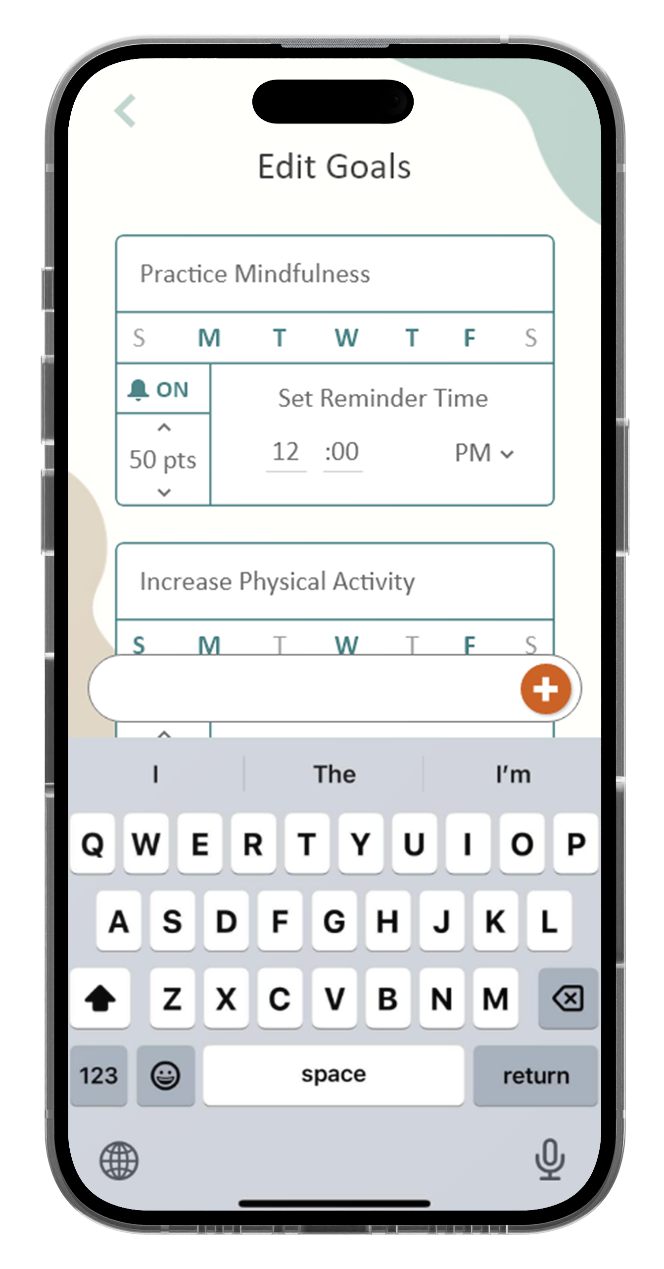
Quick edits to goals
Sharing images and progress
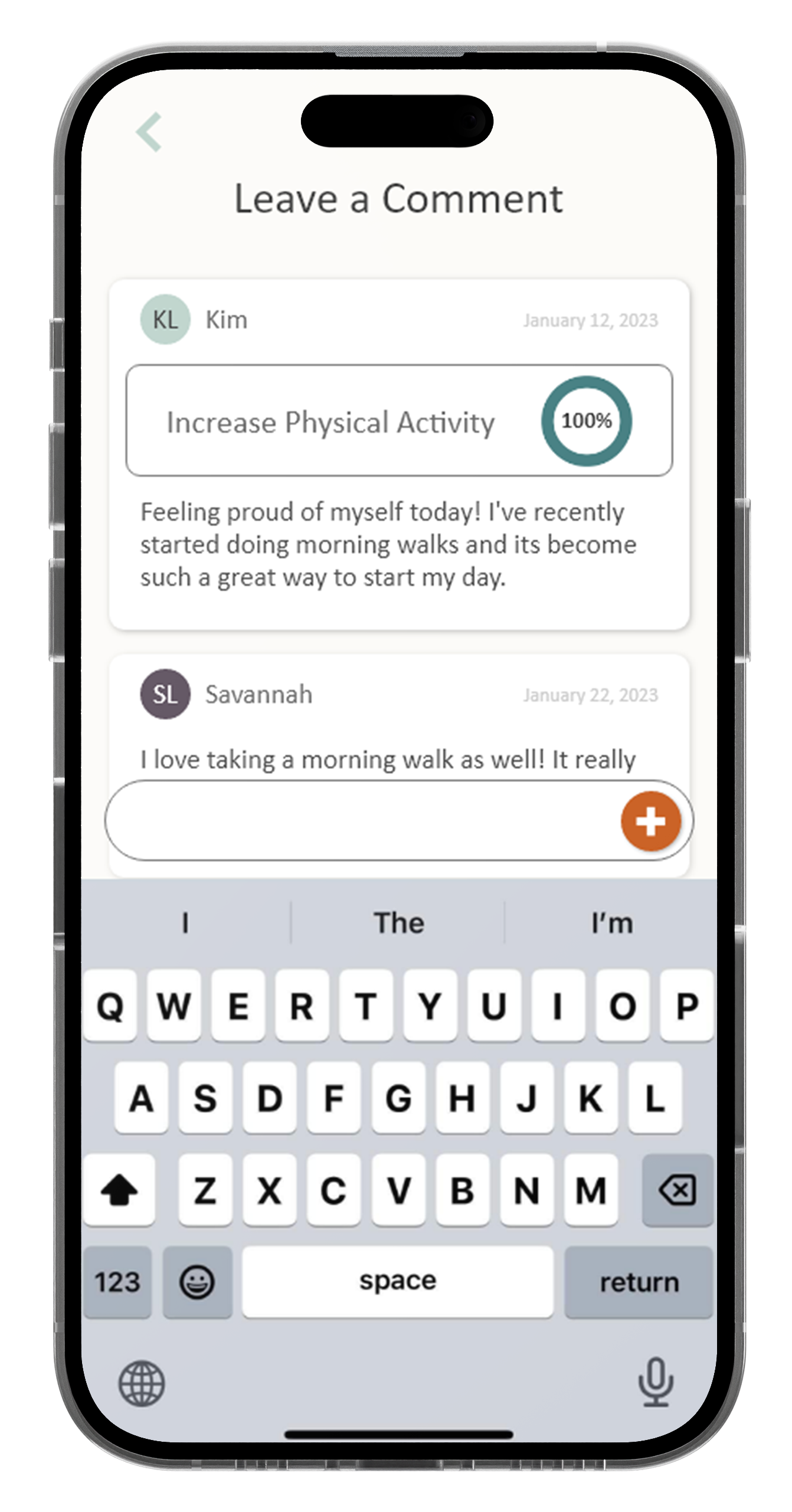
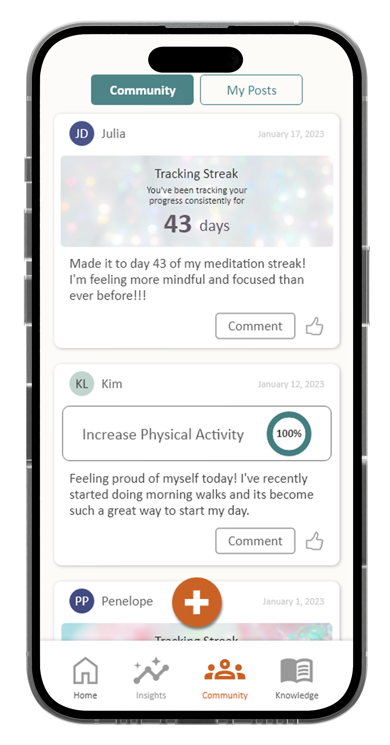
Community posts and support
User Research
After interviewing participants to establish common themes and pain points, it was clear that the goals they had concerning their physical and mental health fell into specific categories that the Thrive Buddy app supports. I asked a variety of questions to help expand my understanding of the habits and obstacles that users have when attempting to choose healthy alternatives in their day-to-day life.
What kind of goals does the user have?
What role does an online community have on a user and does it impact the adoption of healthy habits?
What motivates the user to consistently keep healthy habits?
What challenges do users have in maintaining healthy habits?
Competitive Analysis
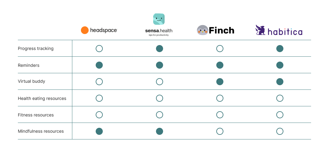
To establish a strong foundation for Thrive Buddy, I examined existing features of similar platforms and identified ways for the app to cater to the target audience and their needs.
Understanding the User
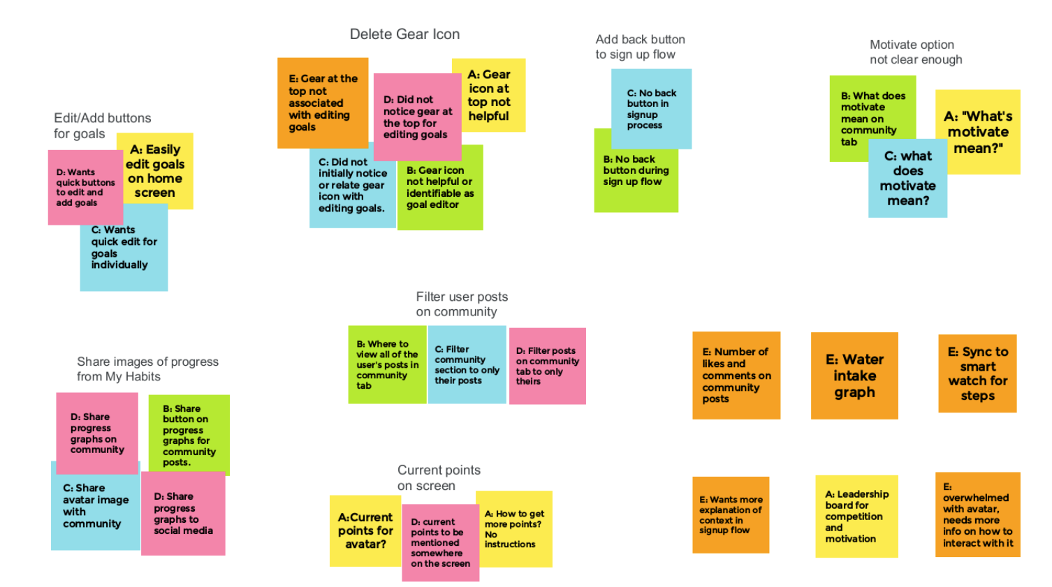
To gather insights into user needs and preferences, I used an affinity diagram, which allowed me to group and analyze data from user interviews and surveys. From this, I identified common themes and pain points among users. Additionally, I created an empathy map that also helped me gain a deeper understanding of users' thoughts and emotions when engaging with the app. With these insights, key features were prioritized and included in the mobile app, such as customizable goals and reminders, community tabs and shareable progress, and a virtual buddy feature for support and accountability.
Meet the Users
Name: Alex
Age: 21
Occupation: Full-time Student and Part-time Retail Employee
Alex is a busy college student, who struggles to balance classes and work while maintaining healthy habits. She’s gotten accustomed to skipping meals and resorting to fast food, she also neglects organization, sleep, and exercise. Limited healthy and affordable options, coupled with a tight budget, have left her feeling unmotivated. Though she has used progress-tracking apps in the past, they lacked the interactive features she desired.
Name: Emily
Age: 25
Occupation: Office Admin
Emily is a busy young adult who wants to improve her overall wellness and feel more confident in her body. She's interested in finding healthy recipes and meditation techniques, as well as tracking her progress through blogging or sharing with a community online. Emily's job is stressful and she's not very physically active, so she wants to prioritize her mental and physical health. However, she's unsure of where to start or how to approach it.
User Journey
Paper Wireframes
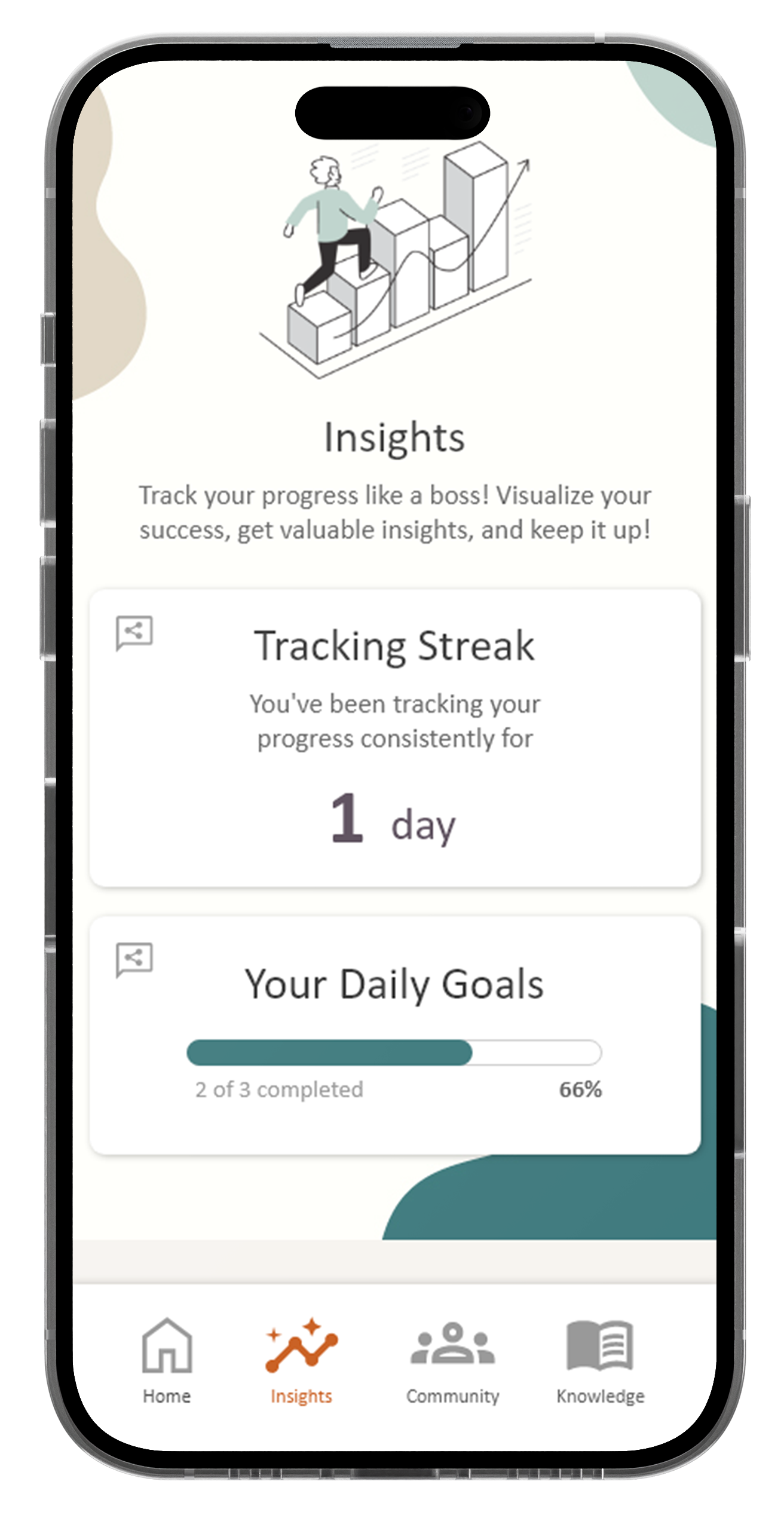
For the mobile app version of Thrive Buddy, I aimed to keep all content in categories that were easily accessible and that made sense to the user when navigating through screens. In later iterations, the navigational options changed, as “Insights” and “My Goals” were combined to offer the user quicker access to their progress.
Challenge #1
Quick Edits to Goals:
During the user testing phase, the feedback received from participants involved a more streamlined process for editing their goals and notifications. They expressed a desire to have easy access to both features in the same section of the goal-tracking area of the home page. This design change not only makes the app more user-friendly, but also helps users stay motivated and engaged with their goals by allowing them to quickly and easily make adjustments as needed.
Challenge #2
Sharing Images & Progress:
Participants of the usability study expressed a desire to share their progress summaries and insights with images. They wanted to be able to easily showcase their accomplishments and share their journey with the Thrive Buddy community. By enabling users to visually document their progress and share it with others, they are able to foster a sense of community and support for achieving healthy habits.
Challenge #3
Community Posts & Support:
Users were interested in engaging with the community section of the app. However, they expressed concerns about navigating through a cluttered community feed. I added a filter option that allows users to switch between viewing the overall community feed and their personal posts only. This feature ensures that users can easily find their own posts and track their progress, while still being able to interact with the broader community.
User Flow
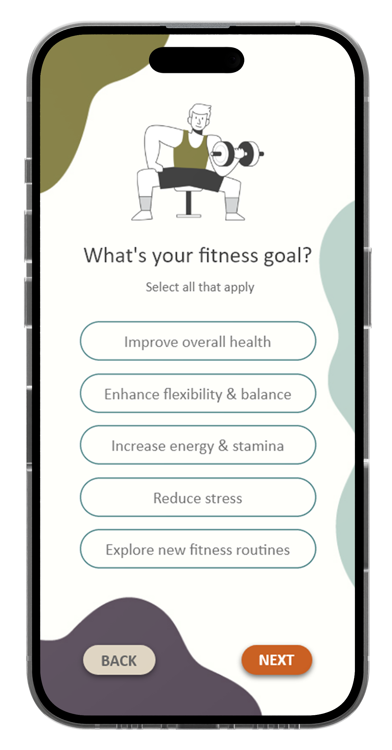
The sign-up process was designed to be an introspective journey for the user. By guiding the user through a series of questions, the app will analyze the user's input and provide personalized articles and resources that cater to their needs in the knowledge section. This helps the user to evaluate what goals they'd like to work on and also creates a sense of ownership and empowerment over their journey towards a healthier lifestyle.
Responsive Design
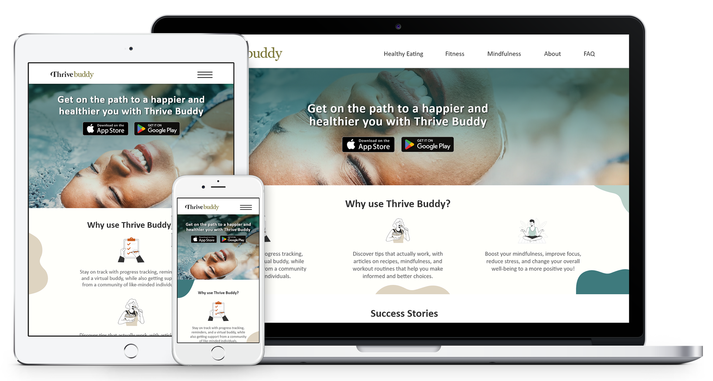
The web version of the app has key differences from the mobile app because of the unique features of each platform. While the mobile app prioritizes quick access to key features, such as goal-tracking and reminders for users on the go, the web version of the app focuses more on the knowledge section and resources. Users are more likely to spend extended periods of time on a desktop, which is an ideal platform for in-depth articles and educational resources. The web app's larger screen size allows for more visual content, making it easier to engage with the material.
iPad View
Desktop View
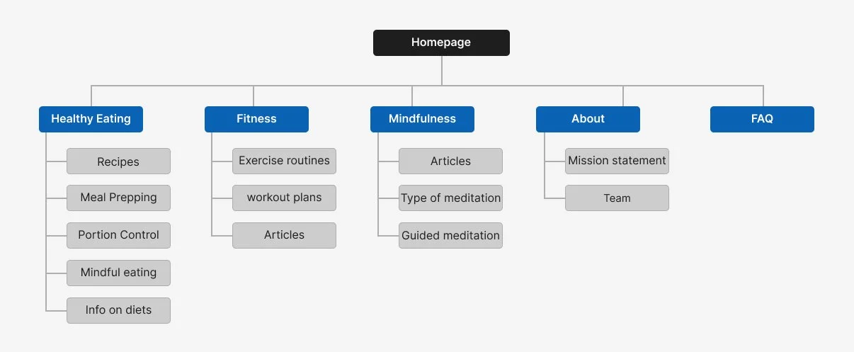
Sitemap
The sitemap for the web version of Thrive Buddy differs from the mobile app, which allows for a tailored experience to the different contexts of use. By focusing on the knowledge section, users can access comprehensive information and resources that can benefit their health and wellness journey.
Accessibility Considerations
Typographic Hierarchy
Text size and color contrasts were heavily considered when designing the layouts for each screen in an effort to make it easy for users with visual impairments to navigate throughout the app freely.
Clear & Concise Language
Clear and concise language was used to avoid any overly complicated terminology, as well as clear descriptions for content that might be new to users, especially when dealing with mindfulness and other nuanced techniques.
Flashing Content
While the virtual buddy feature of the app is animated, the app will avoid flashing content as it can trigger seizures for users that suffer from epilepsy and other forms of neurological issues.
Takeaways
A takeaway from this project was the impact of personalization on user engagement. Users want to feel engaged and motivated when using the app, which is why the app features customization and gamification elements to make the experience more enjoyable and rewarding. The web version of the app places greater emphasis on the knowledge section, providing users with a more comprehensive resource for healthy living. User feedback played a critical role in the development of the platform, resulting in a product that truly meets the user’s needs.
